
Sooner or later, Google is switching to a mobile first index, prioritising websites for their friendliness to mobile platforms. It’s believed that this won’t occur until 2018 at the earliest, but there’s no reason to not get prepared now.
In fact, being mobile friendly has always been beneficial, especially as mobile browsing continues to rise. So, how can you adapt your website to take advantage of this increasing shift towards phones and tablets?
Responsive Web Design
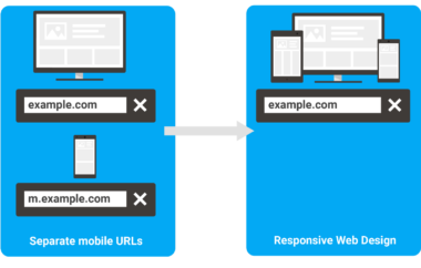
In the past, there have been numerous ways to adapt to mobile browsers, with purpose-built websites being one of the most primary. This was often a separate domain, or a subdomain within the main site, complete with pages designed specifically for mobile sites.
However, this causes numerous problems in the long run.
- It requires running two different websites, uploading content twice
- Google will crawl and rank the websites as separate entities, rather than having one page gain all the link power.
- Backlinks could only link to one URL, so you often had to favour one page over the other anyway
Instead, modern design favours responsive websites. This is a more complex to implement, but the theory is sound. Responsive websites adapt to the device being used, rather than having duplicate pages for different devices. In an age with different screens, this is becoming a more and more important feature to have.
In one responsive design case study, Moz notes that a client – previously having no mobile page at all – moved to a responsive design and received an increase of traffic in excess of 20%. Yet that was just from tablet users alone – a segment that had previously been ignored.
This, in turn, also improved the visibility of the website. Moz notes visibility on the first page jumped up by 77.79% over the first three months., arguing this is down to the better user experience (and, hence, value) offered by a responsive site.
Other tests have also shown that, compared to mobile pages, responsive pages are better as landing pages for PPC adverts. In short, people like websites that readily adapt to their device.
Just make sure, of course, that you move your mobile site carefully. Use redirects and rel=can tags to point Google in the right direction.
Loading Speeds
Another crucial factor for mobile devices is loading speeds. Nobody wants to wait for slow pages to load and, when it comes to mobile browsing, this argument is stronger than ever. Strong enough, in fact, that load times are a well known factor when it comes to Google’s top priorities for mobile websites.
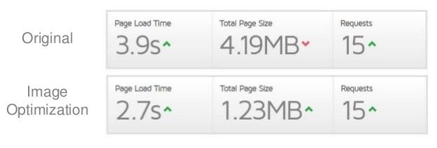
Fortunately, there are plenty of things you can do to improve your speeds. Search Engine Watch found that reformatting, optimising and occasionally replacing images can make websites load over 30% faster – over 1 whole second.
Of course, it’s worth noting that there are many ripple effects to loading times. High waiting periods can lead to increased bounce rates and even cause a decline in conversions. All of this influences how users – as well as Google – views your website.
The bounce rate issue is well known among SEO circles. As Little Data points out, the longer it takes to load, the more people abandon the page – and the website.
https://blog.littledata.io/wp-content/uploads/2017/04/fastcompany.jpg
Remember earlier, we mentioned how resizing and reformatting images could shave a second off? That’s enough to drop abandonment rates by a noticeable amount.
Accelerated Mobile Pages – AMP
Another point worth mentioning here is AMP. This is being heavily pushed by Google and, in essence, its an opensource project designed to load and publish web pages faster. Since it’s something Google has its eye on, as well as something purpose built to make mobile pages more efficient, it’s certainly worth considering.
Looking at a case study by 2 Dogs Media, it’s clear that AMP does have some effect. When improving a client’s website, they used AMP to improve the entire site, including pages that weren’t previously indexing successfully or getting traffic.
The result? Over 300 pages were indexed. It was also observed that, in many cases, AMP pages received more clicks and impressions than their non-AMP counterparts. This would, potentially, indicate a strong favour towards AMP pages within search engine algorithms.
https://www.2dogsdesign.com/wp-content/uploads/2016/12/december2016-amp-analytics.jpg
Of course, whether or not you can easily implement AMP depends on your existing website. But it’s worth nothing that this isn’t just limited to mobile browsing. After all, we already discussed having one responsive design, so your entire website will likely be impacted by such a choice.
Putting It All Together
Still, it’s clear to see that many of these factors are already being preferred by Google and it is very likely this will continue as we move forward.
In other words, you should make sure your website is:
- Responsive across all platforms and devices
- Quick to load – try and shave as many seconds off as possible
- Uses AMP to meet with Google’s expectations
Keep this up and you will get a website that is easy to load and keeps users on the page. In turn, search engines will favour your site over those that have yet to make such changes. This is one reason – if not the most important and only reason you arguably need – to start making these changes now.